For the last several years, I've been feeling like my own brand has been quite neglected - and out of touch with the direction my business has taken. I have learned a lot over the last 10+ years as a designer and helping others develop their brand. When I created the logo for Sparrow Ink Design, I only had a few years of experience under my belt and barely half a degree.
The last few years especially, I feel like my brand has not been servicing my business as well as it could, so I finally found the gumption to re-brand. Designing for yourself is kind of like a 'the cobbler's kids have no shoes scenario' - it's very hard to work for yourself and make it a priority.
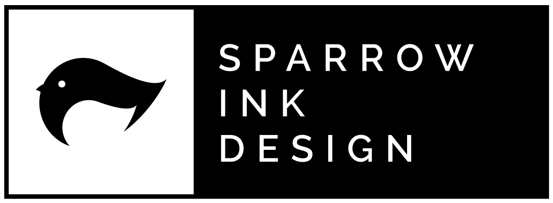
After seeking advice and input from several designers and non-designers, I am very proud of the new cleaner look of Sparrow Ink Design:

I decided to keep the basic shape of the bird, but simplify it down to the core elements. I also made the difficult decision and dropped the green color that I have been using because I felt like the black communicated the essence of ink better than the green. It's also much more readable, clean and modern. My goal was to create a logo that was cleaner and business-like to attract business-minded clients.
I feel that this rebrand has been a successful journey for me and my business as I had to take time to evaluate not only the visual presence of my brand but the experience and values that stand behind it. If you would like to know more about how we can help your business' visual identity connect with your customer base, feel free to contact us for a free consultation.